9 min read
How to Build a Web Design Swipe File You’ll Actually Reuse
Most swipe files die because a screenshot cannot answer the question you will ask it later. A capture-and-tag system built on one rule: save the reason, not just the picture.
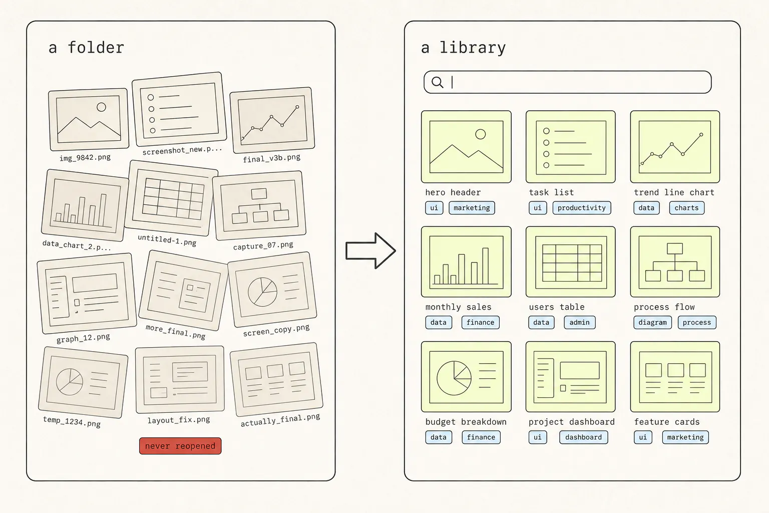
Almost every designer and front-end developer has a folder of saved screenshots. Almost nobody opens theirs. That is not a discipline problem — it is that a picture with no context cannot answer the question you will eventually bring to it, which is never “show me nice websites” and always “how have other people solved this?”
Why swipe files rot
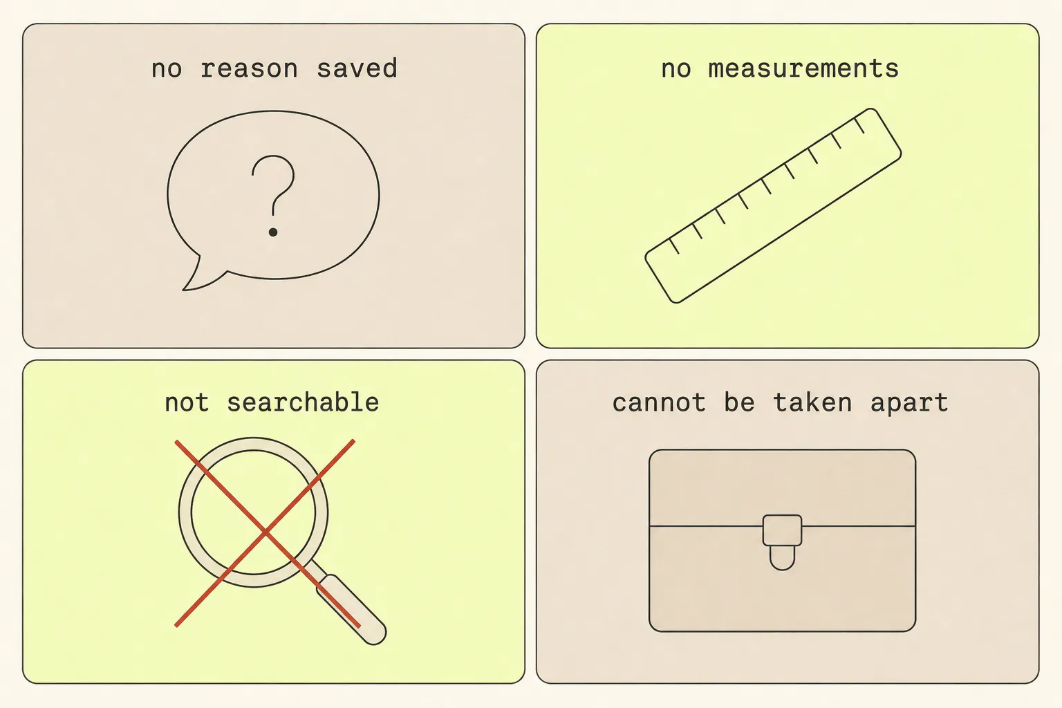
1. You saved the picture, not the reason
Six months later you are looking at a screenshot of a pricing page. You saved it. You have no idea whether it was the tier comparison, the way the annual toggle animated, the microcopy under the button, or the fact that the middle plan is 8px taller than the others. The insight was in your head at the moment of saving, and you did not write it down.
2. It is not searchable
A folder of Screenshot 2026-03-14 at 11.42.08.png is a folder of nothing. Neither the filename nor the pixels are searchable by the thing you care about, so the only way to find anything is to scroll — and nobody scrolls 400 thumbnails.
3. It has no measurements
You want to know the spacing rhythm, the type scale, the exact easing on that transition. A screenshot has none of that. You can measure pixels off the image if you know the capture width, which you did not record, and you can guess at the timing, which you cannot.
4. You cannot take it apart
The most useful thing to do with a reference is to strip it back and see what is holding it up. A picture will not let you. You cannot delete a layer to check what it was doing, or resize it to see how it reflows.
The rule: save the reason
One habit fixes most of this. When you save something, write one sentence answering: what problem does this solve?
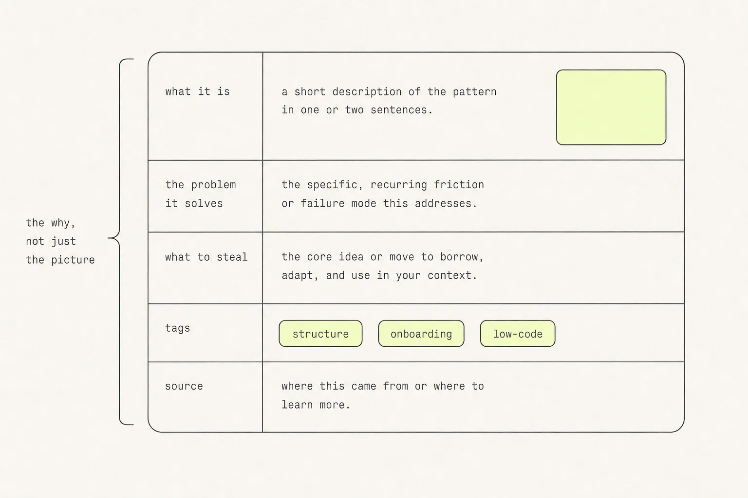
| Field | What goes in it |
|---|---|
| What it is | The pattern in three words. “Pricing table”, “empty state”, “onboarding checklist”. |
| The problem it solves | One sentence. “Makes the middle tier feel like the default without saying so.” |
| What to steal | The specific mechanism. “Annual toggle animates the price rather than swapping it.” |
| Tags | Two to four, from a list you keep short. See below. |
| Source | The URL and the date. Pages change; you will want to know when you saw this. |
Thirty seconds per save. If that feels like too much, it is a useful signal — the ones you cannot be bothered to describe are usually the ones you would never have used.
Tag by problem, not by site
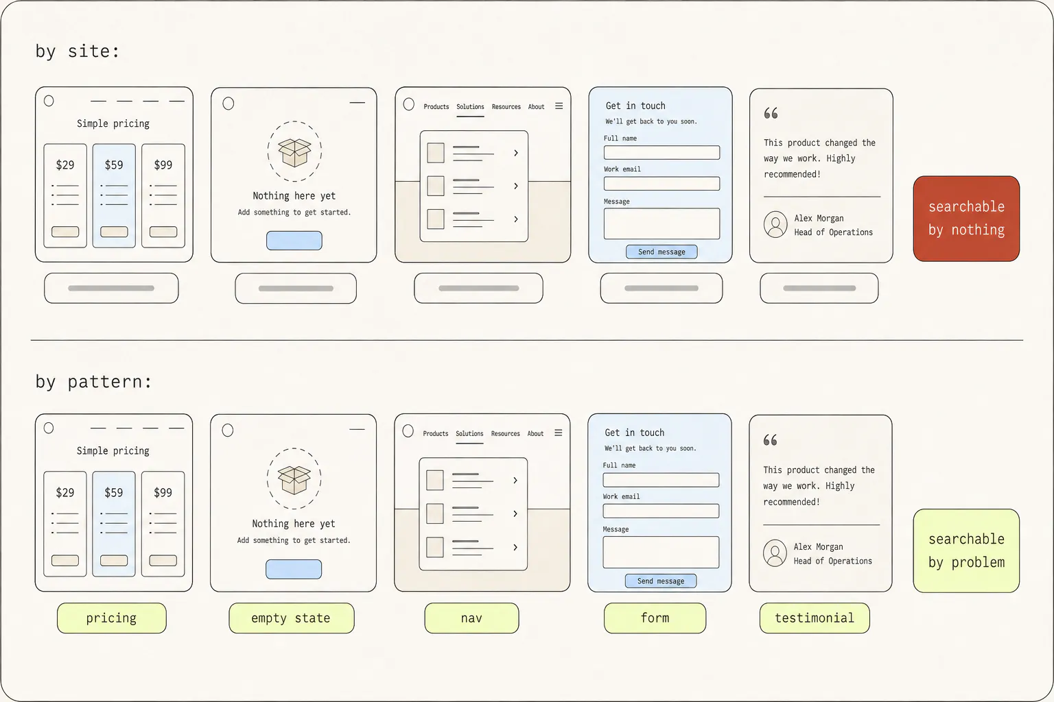
Filing by source is the natural instinct and the wrong one. Nobody has ever thought “I need to see what that analytics company did.” They think “I need to design an empty state.” The tags have to match the second question.
Keep the vocabulary small enough to remember — twenty to thirty tags across three axes:
- The pattern.
pricing,onboarding,empty-state,nav,form,table,testimonial,footer,404,settings. - The quality you liked.
motion,typography,density,colour,microcopy,illustration,hierarchy. - The context.
mobile,dashboard,marketing,docs,ecommerce.
Resist adding a new tag when an existing one nearly fits. A vocabulary of 200 tags is identical in practice to no tags at all, because you cannot remember which one you used.
When a screenshot is not enough
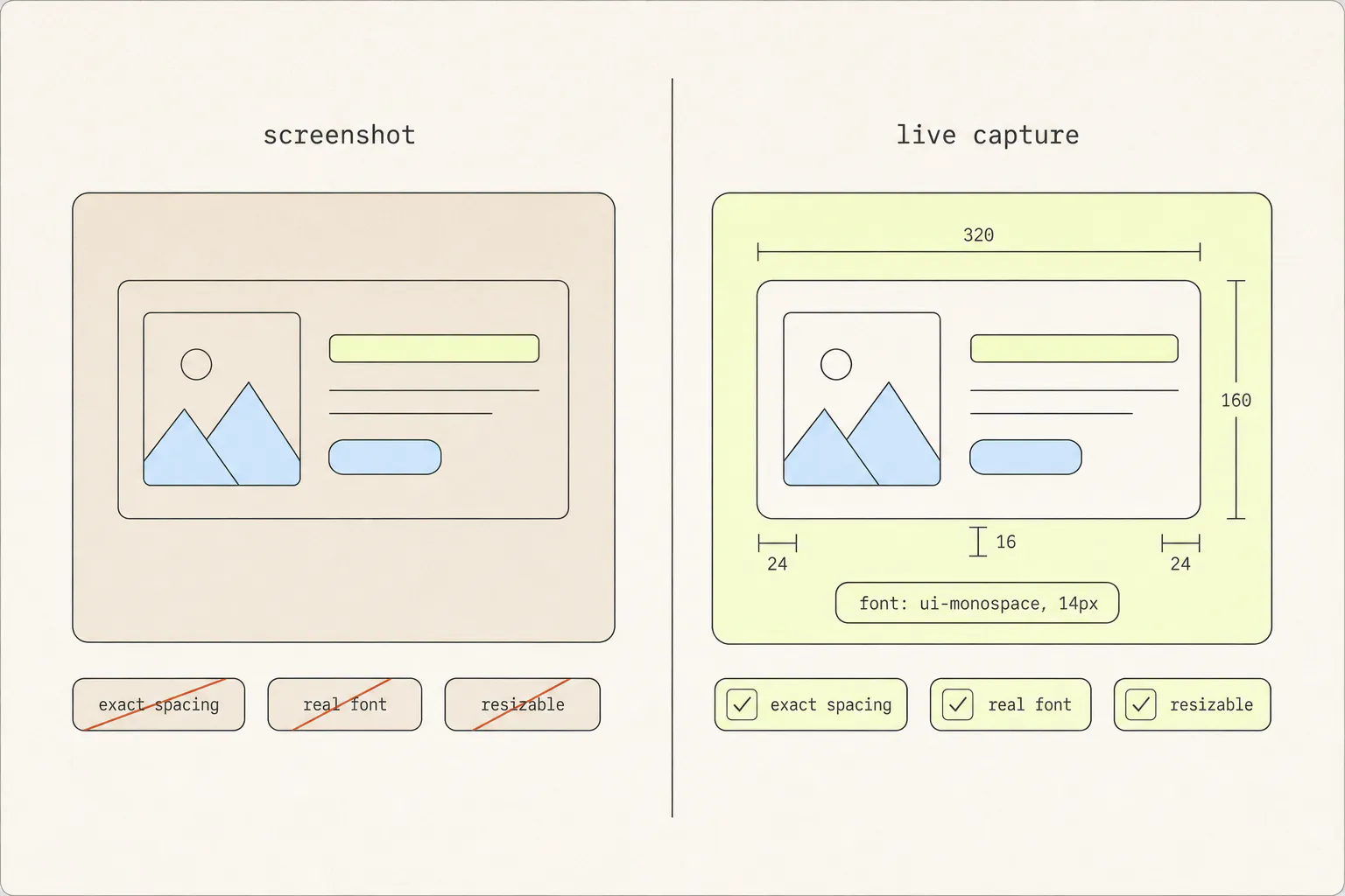
Most of a swipe file can be images — you are collecting impressions, and impressions photograph fine. But for anything you are seriously considering rebuilding, an image throws away exactly the information you will need.
| Question you will ask | A screenshot | A live capture |
|---|---|---|
| What is the exact spacing scale? | Measure and guess | Read it off the styles |
| What font is this, at what weight? | Guess, or use a font identifier | It is in the CSS |
| What does it do on hover? | You saved one state | Hover it |
| How does it behave at 375px? | Unknowable | Resize it |
| What is the easing on that transition? | Unknowable | It is in the keyframes |
| What happens if I remove the icon? | Unknowable | Delete it and look |
This is the case Grabby was built for. Capturing an element takes the same click as a screenshot but keeps the real HTML and CSS — hover states, keyframes, webfonts, the lot — and opens it in an editor where the component is live. You can resize it between desktop, tablet and mobile, pull pieces out to see what they were doing, and export standalone HTML or a JSX component when you decide to build with it.
The mechanics of getting that right by hand are covered in copying the HTML and CSS of an element, and turning it into a React component picks up from there.
A workflow that survives a busy week
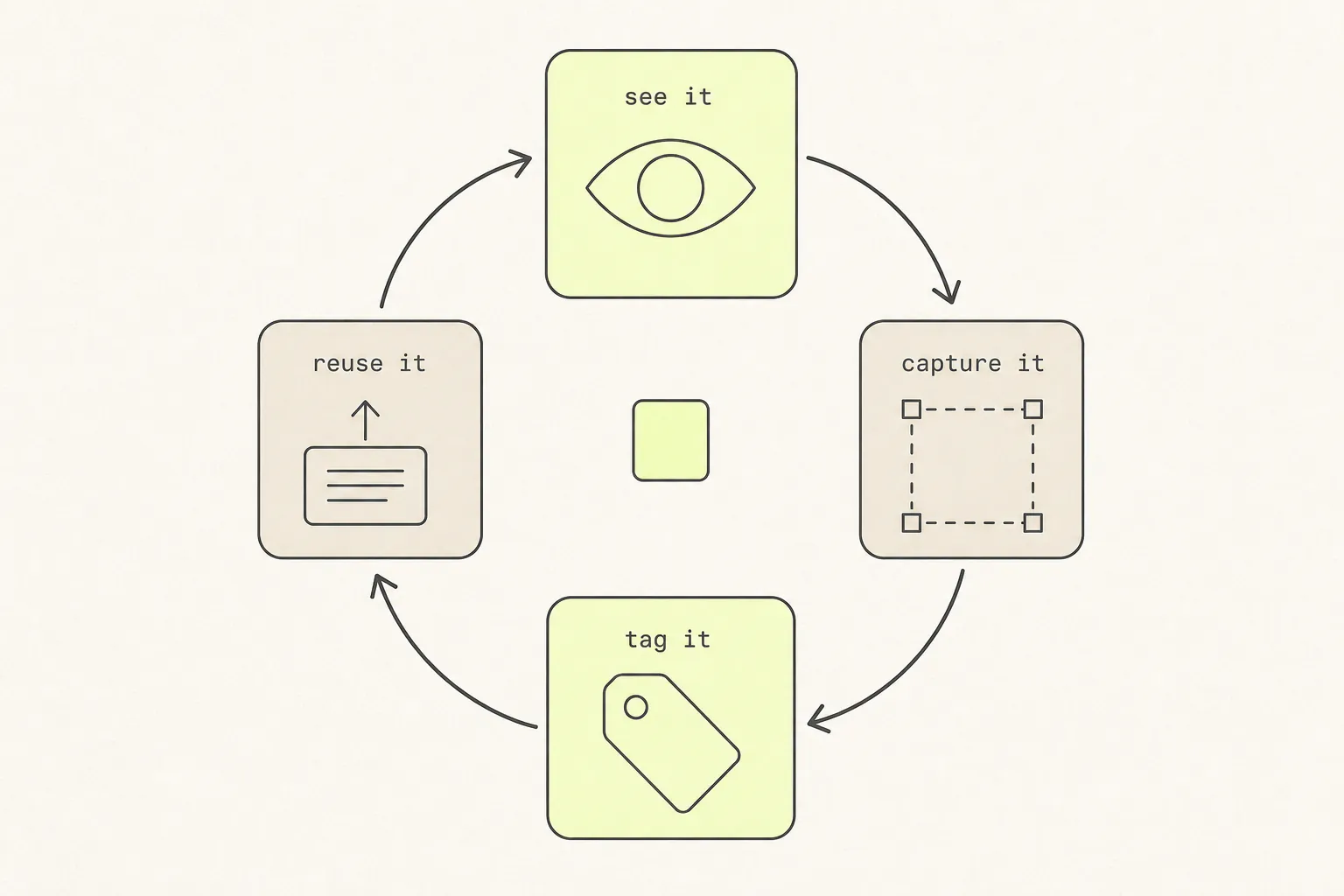
The system only works if capturing costs almost nothing. Anything that requires opening an application, naming a file and choosing a folder will not survive a deadline.
- Capture in one action. A keyboard shortcut or a toolbar click. Full page for a whole layout, element capture for a component you might rebuild.
- Crop immediately. A capture of the whole page when you meant one card is a capture you will not recognise later.
- Write the sentence. The problem it solves. Thirty seconds, while you still remember.
- Tag from your fixed list. Two to four tags. Do not invent new ones in a hurry.
- Weekly, review the last week’s saves. Delete half of them. This is the step everyone skips and the one that keeps the collection worth searching.
Where it lives matters less than that it is one place with a search box. Notion, Obsidian, Raindrop, Eagle, a folder of markdown files — all fine. What is not fine is three places, because then it is zero places.
---
pattern: empty-state
tags: [empty-state, microcopy, illustration, dashboard]
source: https://example.test/app/reports
seen: 2026-08-14
capture: ./captures/reports-empty-state.png
---

# Reports — empty state

**Problem it solves:** turns a dead screen into the first step of onboarding,
without a modal.

**What to steal:** the illustration is small and off to one side rather than
centred and huge — the primary action stays the visual centre of the screen.
Body copy is one sentence and names the benefit, not the feature.
Actually using it
A swipe file is not a mood board. Its job is not to be browsed for inspiration when you are stuck — it is to be queried when you have a specific problem.
The habit that makes it pay off is small: before designing anything, search it first.
- Search the pattern, not the vibe. Look up
empty-statebefore you draw an empty state. Ten seconds, and you start from ten prior attempts instead of a blank canvas. - Read your own notes before the images. The sentence you wrote is a better index than the thumbnail.
- Look for the disagreements. Where five saved examples solve the same problem differently, you have found a genuine design decision rather than a convention — and that is where the interesting choice is.
- Note what you rejected. “Tried this, it did not work because…” is the most valuable note in any swipe file and the rarest.
Start with twenty
Do not migrate your existing folder. It has no notes, no tags, and you have already demonstrated that you will not open it.
Start empty. Save twenty things properly over the next month — full note, real tags, cropped image, live capture for anything you might build. Twenty well-described references you can search will out-perform four hundred screenshots you cannot, and the habit is formed by then.
The only decision you make repeatedly is image or code, and it is worth getting right on the way in rather than discovering later that you saved the wrong thing — what each capture format keeps is the whole of it in one table.
Frequently asked questions
What is a web design swipe file?
A personal collection of design examples kept as reference for later work: pricing tables, empty states, onboarding flows, navigation patterns. The term comes from advertising copywriters, who kept files of ads that worked. The point is not to copy them but to have prior attempts at a problem in front of you before you start on your own.
How should I organise design inspiration?
By the problem the example solves, not by the site it came from or the date you saved it. Keep twenty to thirty tags covering patterns (pricing, empty state, nav), qualities (motion, typography, microcopy) and contexts (mobile, dashboard, marketing). A large tag vocabulary is functionally the same as no tags, because you cannot remember which one you used.
Is it stealing to keep a swipe file?
No — studying prior work is how every design discipline operates, and viewing source has always been part of the web. The line is between mechanisms and assets. A layout approach, a spacing rhythm and an interaction pattern are ideas. A wordmark, photography, illustration, written copy and a licensed typeface are someone’s property. Take the first, leave the second.
Should I save screenshots or bookmarks?
Screenshots, for the most part. Pages get redesigned, taken down, or put behind a paywall, and a bookmark to a page that no longer exists is worse than nothing because it looks like it still works. Save the capture and the URL together — the capture is what you keep, the URL is context for when you want to see the current version.
What is the best tool for a design swipe file?
The one you already have open. Notion, Obsidian, Raindrop and Eagle all work; so does a folder of markdown files next to a folder of images. Two features matter: full-text search over your notes, and a capture path short enough that you will use it under deadline. Everything else is preference.
How often should I prune a swipe file?
Weekly, over the last week’s saves only — that is when you still remember why you kept each one, and it takes about two minutes. Expect to delete around half. A quick pass over anything older than two years is worth it too: design conventions move, and an example that has aged badly is worse than an empty file because it costs you time before you reject it.
Keep reading
10 min read
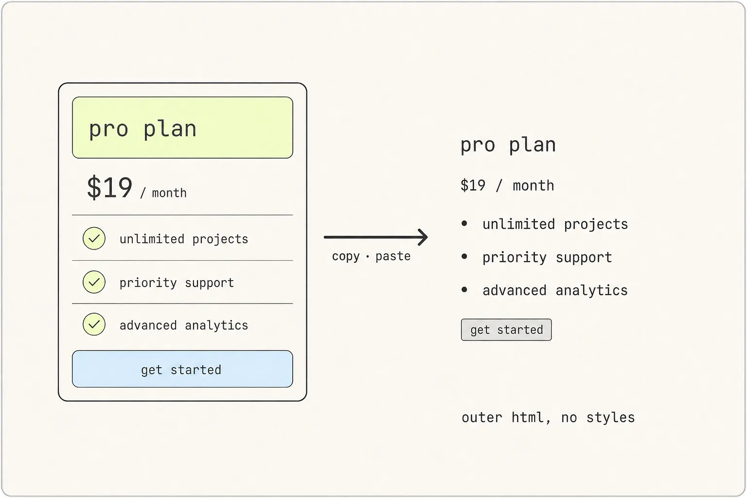
How to Copy the HTML and CSS of Any Element on a Website
The markup is the easy half. The styles are spread across a stylesheet, a :root block, a font declaration and possibly a shadow tree — which is why the paste comes back looking like 1996.
9 min read
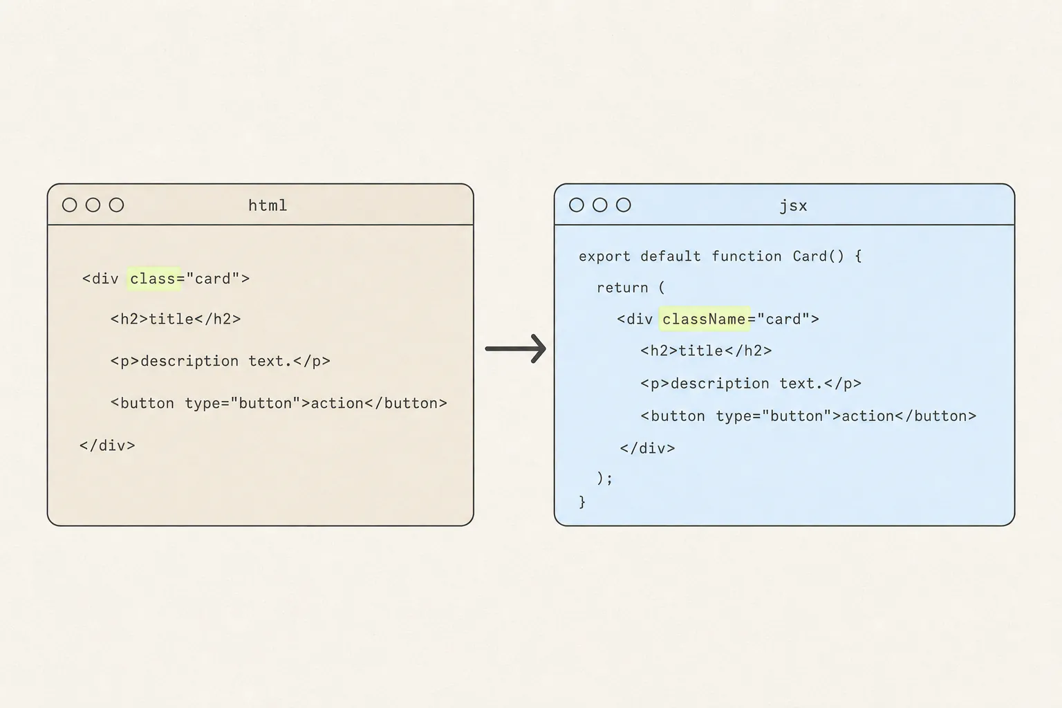
How to Turn a Web Page Element Into a React Component
Converting the markup is a find-and-replace. Converting the component means deciding where its styles live, and that is the part every online converter skips.
9 min read
How to Capture a Web Page: Screenshots, PDFs, and Code
A screenshot, a PDF and a copied component are three different answers to “save this page”. Here is what each one keeps, what each one silently throws away, and how to choose.