9 min read
How to Turn a Web Page Element Into a React Component
HTML-to-JSX converters rename class to className and stop. Here is the rest of the job: resolving the styles, scoping them, carrying the fonts, and keeping the hover states.
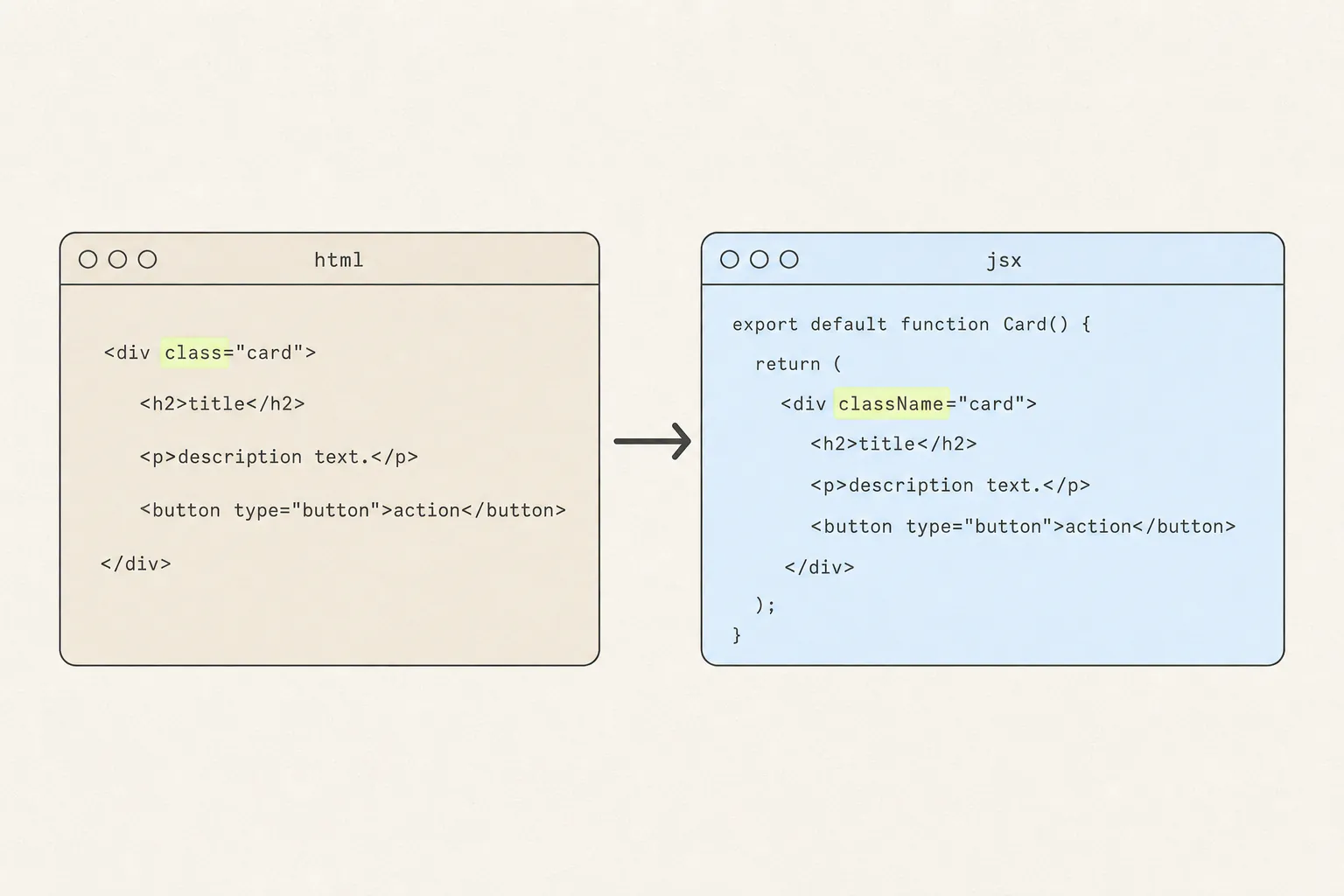
Paste some HTML into an online converter and it hands back JSX in under a second. The result compiles, renders, and looks nothing like what you copied — because the converter did the easy half. Renaming attributes is a find-and-replace. Deciding where a component’s styles live, and making them survive contact with your codebase, is the actual work.
The conversion has two halves
The markup half is syntax: JSX is JavaScript, so anything that collides with a JavaScript keyword or a DOM property name has to be renamed. That is a closed list, and tooling handles it perfectly.
The styles half is architecture. The CSS you want is scattered across a stylesheet, a :root block of custom properties, a @font-face declaration and possibly a media query — and you have to decide how much of that comes into your project and under what names. No converter can decide that for you, which is why none of them try.
This article assumes you already have the CSS in hand. Getting the HTML and CSS off the page in the first place is its own set of problems, and worth reading first if the styles you copied came back incomplete.
Half one: the markup
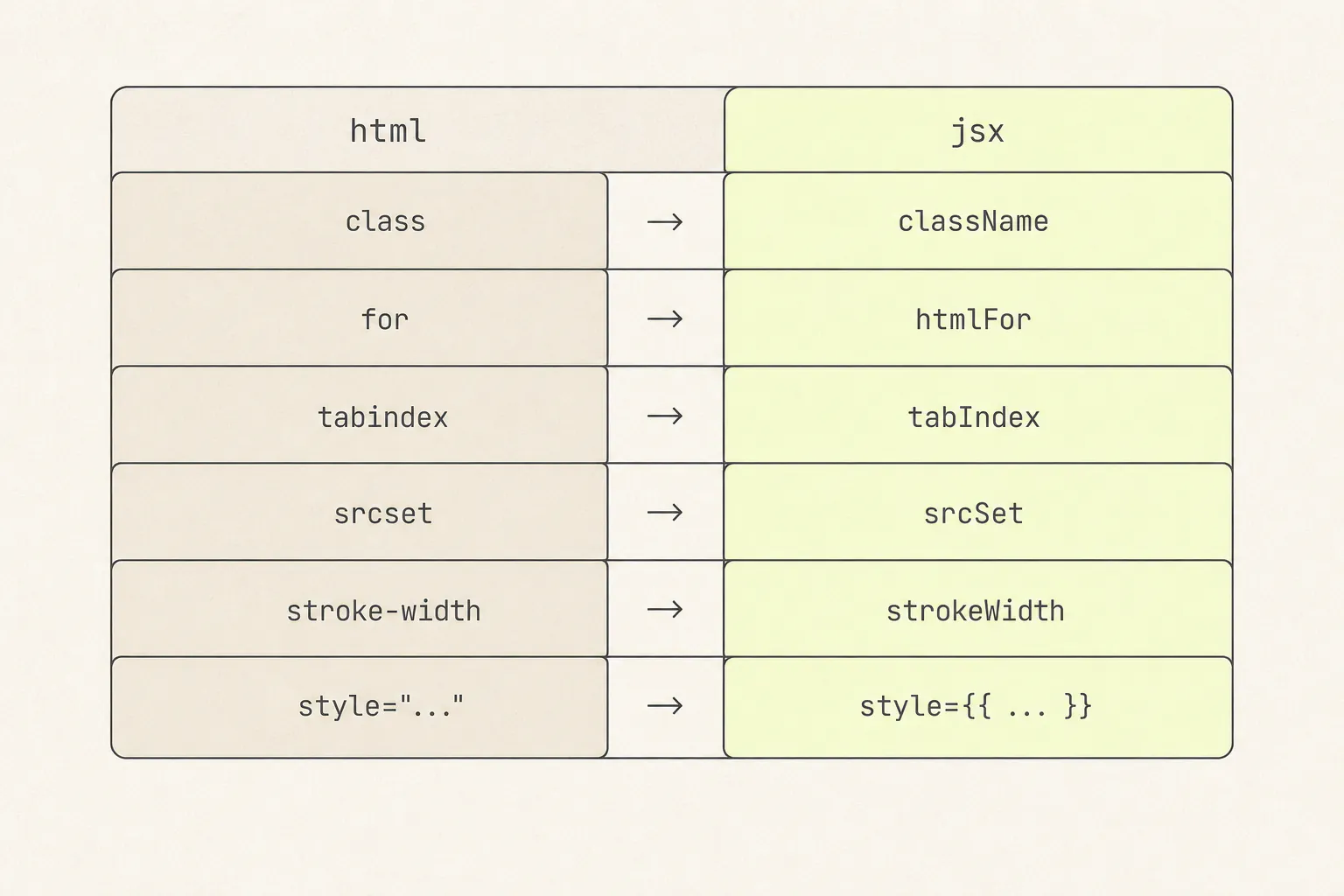
Six rules cover essentially every conversion:
classbecomesclassNameandforbecomeshtmlFor. Both are reserved words in JavaScript.- Hyphenated attributes become camelCase:
tabindex→tabIndex,srcset→srcSet,maxlength→maxLength. SVG follows the same rule —stroke-width→strokeWidth,viewBoxkeeps its capital B. The exceptions aredata-*andaria-*, which stay hyphenated. - Every tag closes.
<br>,<img>,<input>and<hr>become self-closing. - Inline styles become objects with camelCase keys:
style="font-size:14px"becomesstyle={{ fontSize: '14px' }}. Numeric values getpxadded automatically for most properties, but being explicit costs nothing and removes a class of surprise. - Comments change shape.
<!-- … -->becomes{/* … */}. - Boolean attributes need values.
disabledbecomesdisabled{true}or justdisabled;checkedon an input requires anonChangehandler or React warns.
The React DOM reference lists every attribute with its React name, and is the authority when something behaves oddly.
Half two: where the styles go
You have a block of CSS and a component. There are four places the CSS can live, and the choice has consequences.
| Approach | Good for | Cost |
|---|---|---|
| A global stylesheet | Quick prototypes; styles you want to reuse across components | Class names are global. A copied .card silently overrides yours, or is overridden by it. |
| CSS Modules | Most projects. Scoping is automatic and the CSS stays real CSS. | Class names in the copied markup must be rewritten to styles.x references. |
| A <style> tag inside the component | A single self-contained file you can drop anywhere | Still global at runtime — you have to scope the selectors yourself. |
| Inline style objects | Truly one-off values; anything computed from props | No pseudo-classes, no media queries, no @keyframes. Rules out most real components. |
That last limitation is worth stating plainly: React’s style prop sets inline styles, and inline styles have no way to express :hover, :focus, ::before, a media query or a @keyframes block. Any conversion that flattens everything into style objects has thrown away every interactive state in the component.
Scoping, and why it matters
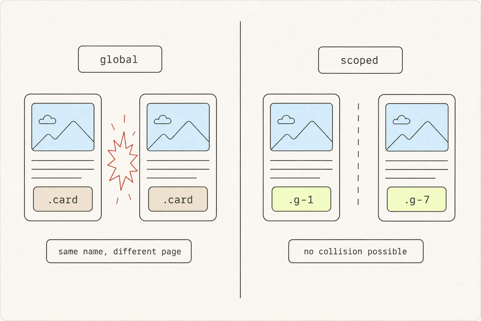
Copied components arrive with names their original authors chose: .card, .button, .title, .container. Your project has those too. Drop the copied CSS into a global stylesheet and whichever rule loses the cascade loses silently — no error, no warning, just a component somewhere else that now has the wrong padding.
Three ways out, in order of how much work they are:
- CSS Modules. Name the file
Card.module.cssand the build tool rewrites every class to something unique. You then reference them asstyles.card, which means editing the markup — but the scoping is free and permanent. - Prefix everything. Rewrite
.cardto.pricing-card__cardthroughout. Crude, works everywhere, tedious past about twenty selectors. - Generated names. Rewrite each rule to a machine-generated class —
.g-1,.g-2— and update the markup to match. Ugly to read and impossible to collide with, which for a lifted component is usually the right trade.
Four traps
1. dangerouslySetInnerHTML
The tempting shortcut is to skip conversion entirely and inject the HTML string. It works, and it costs you everything React is for: no component boundaries, no props, no event handlers, no reconciliation. It is also an injection risk the moment any part of that string comes from somewhere you do not fully control. Convert the markup properly.
2. Fragments and the single root
A component returns one node. If your copied markup is three sibling elements, wrap them in a fragment — <>…</> — rather than adding a <div>. An extra wrapper changes the layout when the parent is a flex or grid container, and that is a bug you will spend an hour on.
3. Whitespace
JSX collapses whitespace between elements differently from HTML. Two inline elements on separate lines in JSX render with no space between them, where the same HTML would have one. If words run together after conversion, that is why — {' '} puts the space back explicitly.
4. Assets with relative paths
Copied markup references images, icons and fonts relative to the original site. Once the component is in your project those paths resolve to nothing. Every src, href, url() and SVG xlink:href has to be re-pointed at an asset you control — and SVG sprite references are the ones people miss, because a broken sprite renders as an empty box rather than a broken-image icon.
The whole pipeline
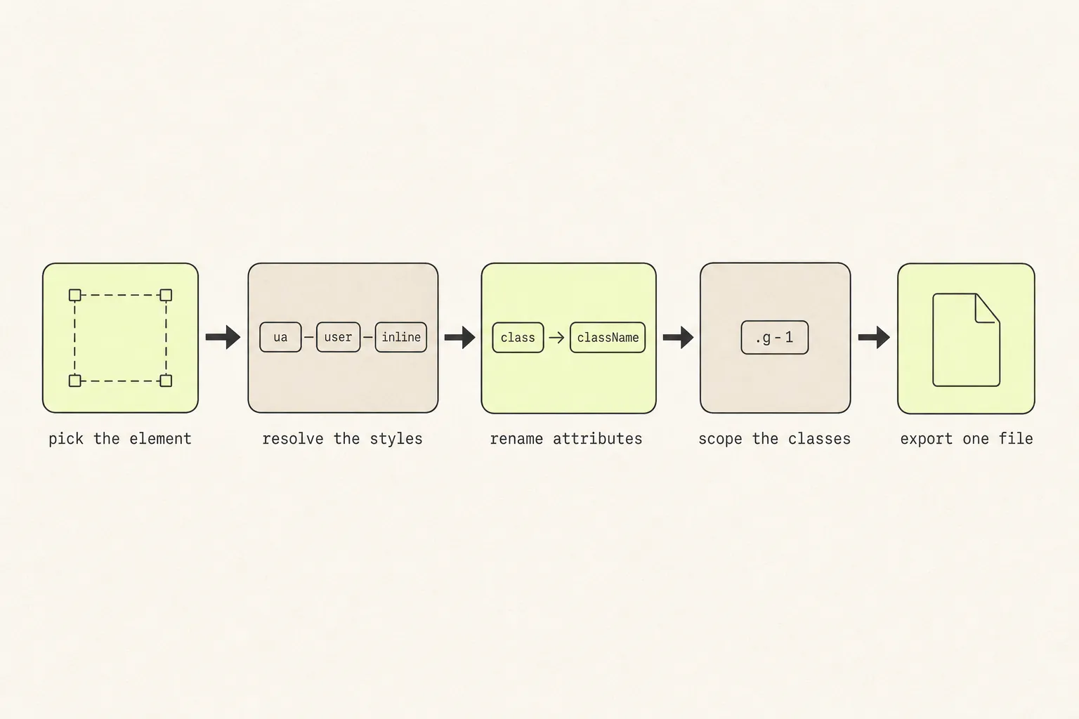
Here is what a finished, self-contained component looks like — the styles travel with it, the class names cannot collide, and it renders correctly with no props and no global CSS:
const css = `
.g-1 { display: flex; flex-direction: column; gap: 12px;
       padding: 24px; border-radius: 12px; border: 1px solid #e5e7eb;
       background: #ffffff; font-family: Inter, system-ui, sans-serif; }
.g-2 { font-size: 13px; font-weight: 600; letter-spacing: 0.04em;
       text-transform: uppercase; color: #6b7280; }
.g-3 { font-size: 32px; font-weight: 700; color: #111827; }
.g-4 { padding: 10px 16px; border: 0; border-radius: 8px;
       background: #2563eb; color: #ffffff; font-weight: 600;
       cursor: pointer; transition: background 150ms ease; }
.g-4:hover { background: #1d4ed8; }
.g-4:focus-visible { outline: 2px solid #1d4ed8; outline-offset: 2px; }
`;

export default function PricingCard() {
  return (
    <div className="g-1">
      <span className="g-2">Pro</span>
      <h3 className="g-3">$19/mo</h3>
      <button type="button" className="g-4">
        Start free trial
      </button>
      <style>{css}</style>
    </div>
  );
}
Three things to notice:
- The
:hoverand:focus-visiblerules are real CSS in the stylesheet, which is the only way they can exist. An inlinestyleobject cannot hold them. - The class names are generated, so nothing in the host project can collide with them.
- The
<style>tag inside the component means the file has no external dependency at all. Useful for a lifted component; you would move the CSS out once it settles into your codebase.
Automating it
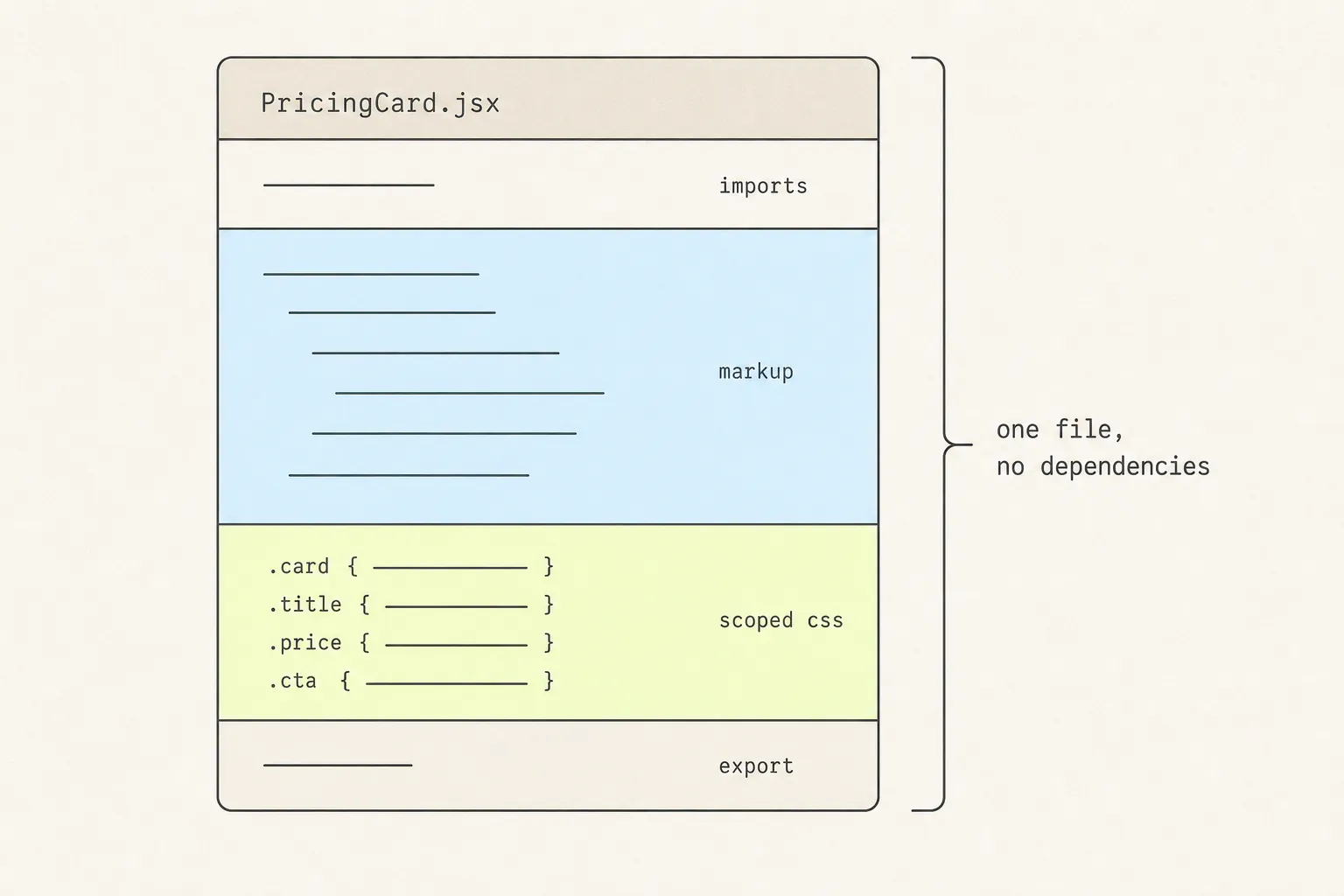
Doing all five stages by hand is a genuinely useful exercise once. After that it is repetitive work with a predictable failure mode: you forget the @font-face, or the ::before, or a var() that resolved to nothing.
Grabby produces exactly the file above. It captures the element with its resolved styles, pseudo-classes, keyframes, fonts and pseudo-elements; you edit it visually if you want to — layers tree, style inspector, desktop/tablet/mobile preview — and export as a single-file JSX component with the CSS deduplicated into generated .g-* classes, or as standalone HTML. Copy to the clipboard or download the file. Capturing and editing are free; export is the paid part.
Either way, the component you end up with is a starting point rather than a finished one. The next hour is spent turning hardcoded strings into props, replacing the copied colours with your own tokens, and deleting the three wrapper divs that existed for a layout you are not using.
Worth checking before any of that: whether you needed a component at all. Converting is the right move when someone is going to build with it — the capture-format comparison is the two-minute version of that decision, and an image is frequently the correct answer.
Before you commit it
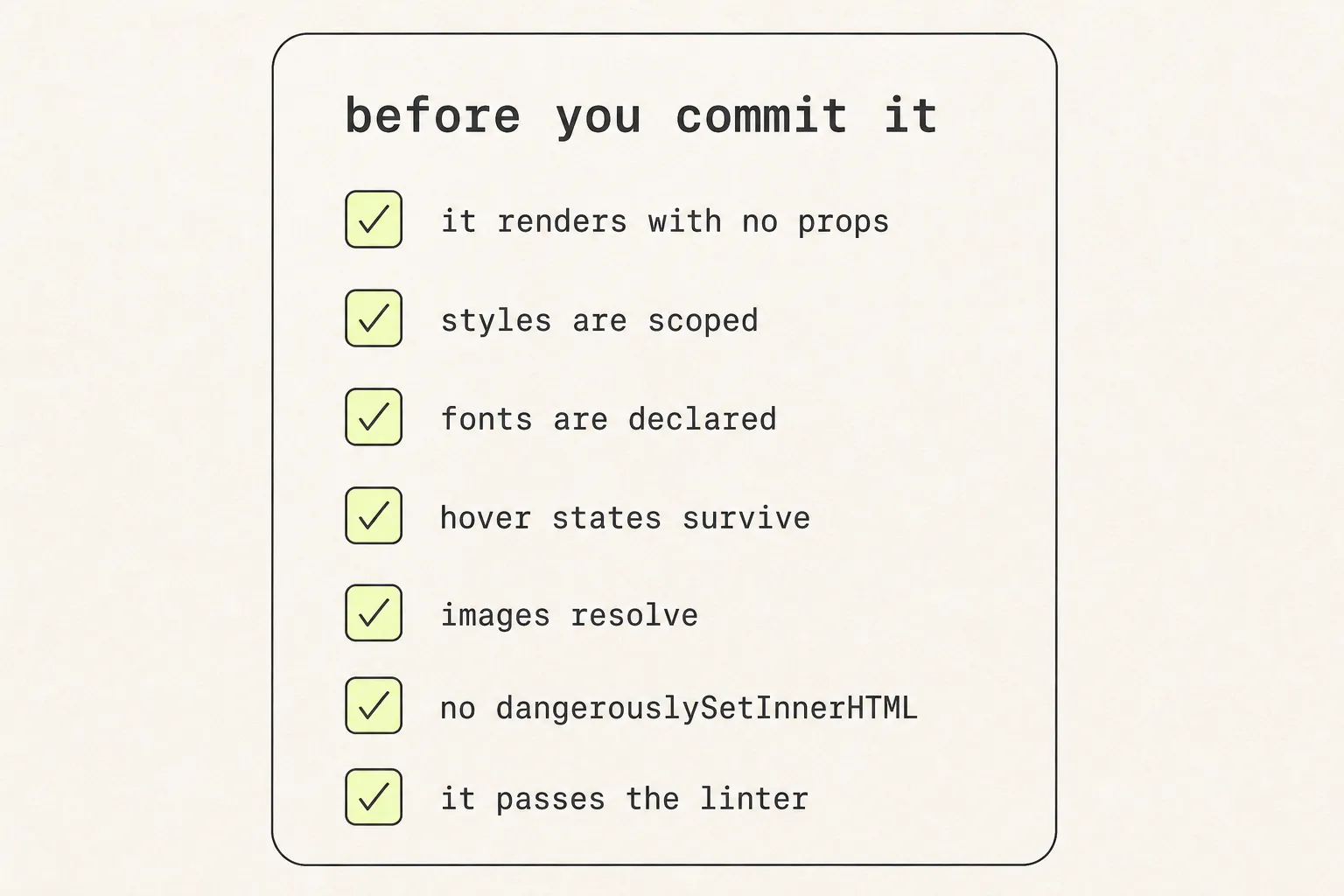
- It renders with no props. Drop it into a blank route and look at it. If it needs context, a provider or a global stylesheet, it is not self-contained yet.
- The styles are scoped. Search your project for each class name it uses. Any hit is a future bug.
- Fonts are declared and licensed. Either the
@font-facecame along and you have the right to use it, or you have substituted something you own. - Hover, focus and active still work. Tab to it as well as hovering — a component with no visible focus state is inaccessible, and that is often what gets lost in conversion.
- Images and icons resolve. Check the network panel for 404s, and look specifically for SVG sprite references.
- No
dangerouslySetInnerHTML. If it is still there, the conversion is not finished. - It passes your linter and formatter with the project’s own rules, not with exceptions added for it.
Frequently asked questions
How do I convert HTML to JSX?
Rename class to className and for to htmlFor, camelCase hyphenated attributes (except data-* and aria-*), self-close void elements, convert inline style strings to objects with camelCase keys, and wrap multiple root elements in a fragment. That is the markup done — the styles are a separate decision, and the larger one.
Why does my converted component look unstyled?
The CSS did not come with the markup. Class names in JSX are just strings; they point at rules that were in the original site’s stylesheet. You need the rules themselves, plus the :root custom properties they reference and the @font-face declarations the type depends on.
Can I use CSS hover states in a React component?
Yes — in a stylesheet, a CSS Module, or a <style> tag. Not in the style prop, which sets inline styles and cannot express pseudo-classes, media queries or keyframes. If a conversion turned all your CSS into style objects, every interactive state was discarded in the process.
Should I use CSS Modules or a style tag for a lifted component?
CSS Modules for anything staying in your project — scoping is automatic and the CSS stays ordinary CSS your tooling understands. A <style> tag is better for a component you want to hand around as one file with no build-tool assumptions, provided the selectors are already scoped by generated names.
Is dangerouslySetInnerHTML a reasonable shortcut?
Only for content that is genuinely opaque HTML from a trusted source, such as sanitised rich text from a CMS. For a component you are lifting, it defeats the purpose: no props, no event handlers, no reconciliation, and an injection risk if any part of the string is ever attacker-influenced.
How do I convert a component to Vue or Svelte instead?
The same two halves apply, with a smaller markup step. Vue and Svelte both accept ordinary HTML attributes, so class stays class and there is no camelCase rename. Both also have scoped styles built in — <style scoped> in Vue, <style> in Svelte — which handles the harder half for you.
Keep reading
10 min read
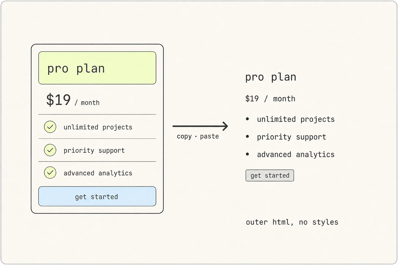
How to Copy the HTML and CSS of Any Element on a Website
The markup is the easy half. The styles are spread across a stylesheet, a :root block, a font declaration and possibly a shadow tree — which is why the paste comes back looking like 1996.
9 min read
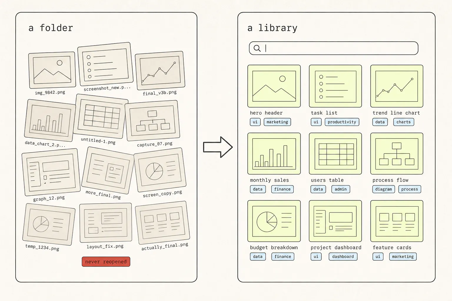
How to Build a Web Design Swipe File You’ll Actually Reuse
You have a folder of 400 screenshots and you have opened it twice. The problem is not discipline — it is that a picture with no context is unsearchable, and nobody browses 400 of anything.
8 min read
How to Screenshot a Hover State, Dropdown, or Animation
Transient UI is the one thing a screenshot key cannot photograph, because taking the screenshot is what destroys it. Three escalating answers, from a checkbox in DevTools to not screenshotting at all.