9 min read
How to Annotate a Website Screenshot So Feedback Lands
The annotation is easy; making it unambiguous is not. Six rules for arrows, numbering, colour and crop that get design feedback acted on instead of re-explained.
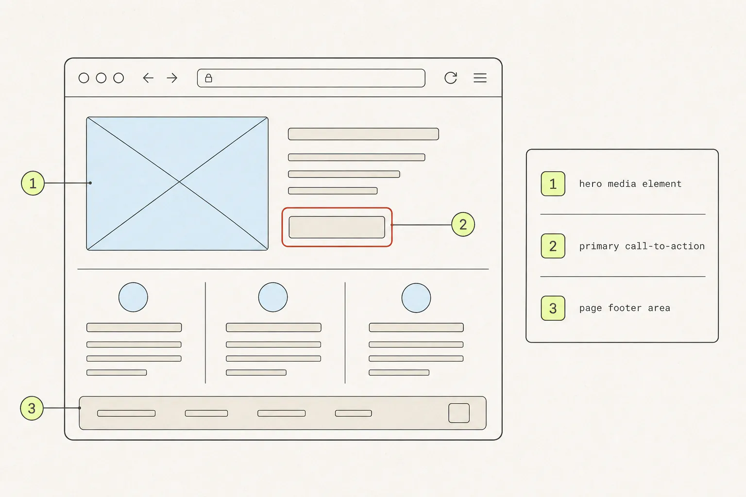
Everyone can draw a red circle on a screenshot. Almost nobody gets a reply that says “fixed” on the first try. The gap is not drawing skill — it is that the image failed to answer three questions the person receiving it was always going to ask: which element, in what state, at what width.
Why screenshot feedback fails
Watch what happens to a badly annotated screenshot. It arrives, the recipient studies it, and replies with a question. That round trip costs a day if you are in different timezones, and it happens for one of four reasons:
- Ambiguity about the target. The circle covers a button, its label, its container and the gap beneath it. Which one is wrong?
- Ambiguity about the problem. A mark says “this”. It does not say whether “this” is too small, the wrong colour, or in the wrong place.
- No reproduction context. The developer opens the page and it looks fine, because they are 300 pixels wider than you were.
- Too many points at once. Six marks and a paragraph of prose beneath them. Two get fixed, four get forgotten, and nobody can tell which.
Each of the six rules below closes one of those gaps.
1. Crop before you draw

A full-page screenshot with one arrow buried in it asks the reader to find your point. A tight crop of the component, plus one arrow, hands it to them. The crop is doing more work than the arrow.
The judgement call is how much surrounding context to keep. Crop to the component and one ring of what sits around it — enough that the reader can orient themselves, not so much that they have to search. If the problem is the relationship between two distant parts of the page, that is one of the rare cases where the whole page is the right frame.
2. Number your points
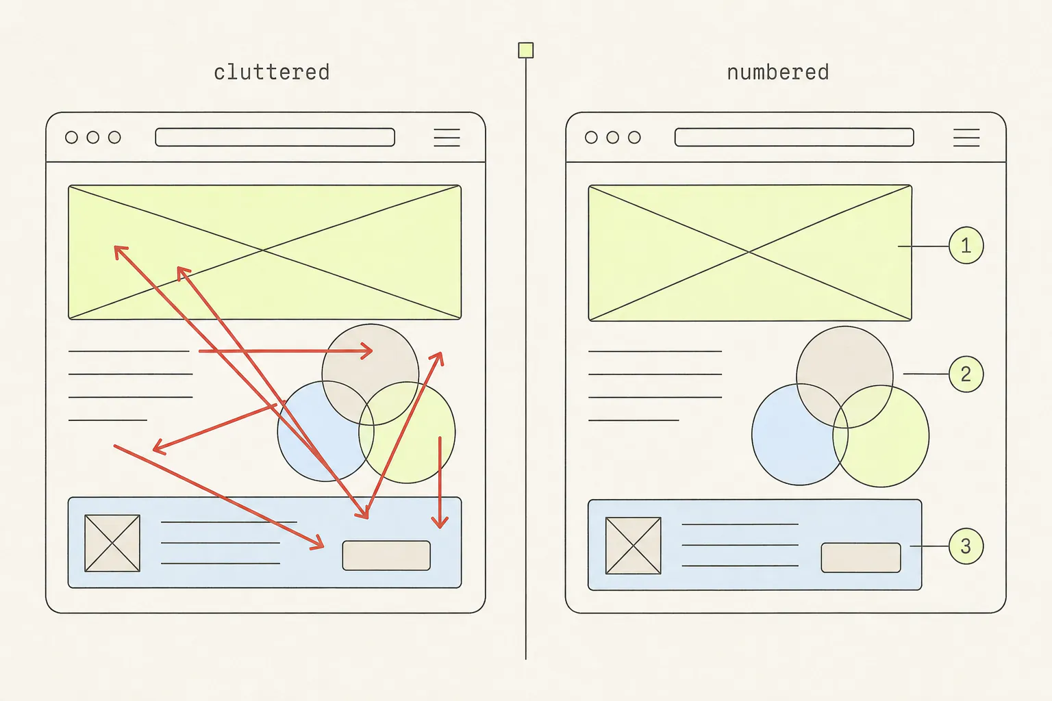
The moment you have more than one thing to say, switch from arrows to numbered markers with a written list beneath or beside the image. This does three things at once:
- It makes each point separately answerable. “1 and 3 are done, 2 needs a design decision” is a reply you can act on. “I fixed the screenshot” is not.
- It moves the words out of the image. Text typed onto a screenshot cannot be copied, searched, or translated, and it is invisible to a screen reader. Numbers in the image, sentences in the message.
- It forces you to be finite. Writing out point seven is when you notice that this should have been two separate reviews.
Keep the count under about six per image. Beyond that, split it — one screenshot per section of the page beats one screenshot with fourteen markers.
3. One mark per claim
A mark is a claim: “something here is wrong”. Two marks on the same element read as two claims, and the reader will hunt for the second problem. Two elements sharing one mark read as one claim, and the reader will guess which element you meant.
The corollary is that shape carries meaning, so use it consistently within an image:
| Mark | Means | Use for |
|---|---|---|
| Rectangle or oval outline | “This element” | A button, a card, a field — anything with an edge you can trace |
| Arrow | “This exact point” | A misaligned edge, a wrong pixel, a gap that should not be there |
| Line | “These two things should relate” | Showing an alignment that is off, or a spacing that is inconsistent |
| Numbered marker | “Point N in my list” | Anything you are writing a sentence about |
| Blur | “Ignore this, it is private” | Real names, emails, tokens — never for emphasis |
4. Pick a colour the page is not using
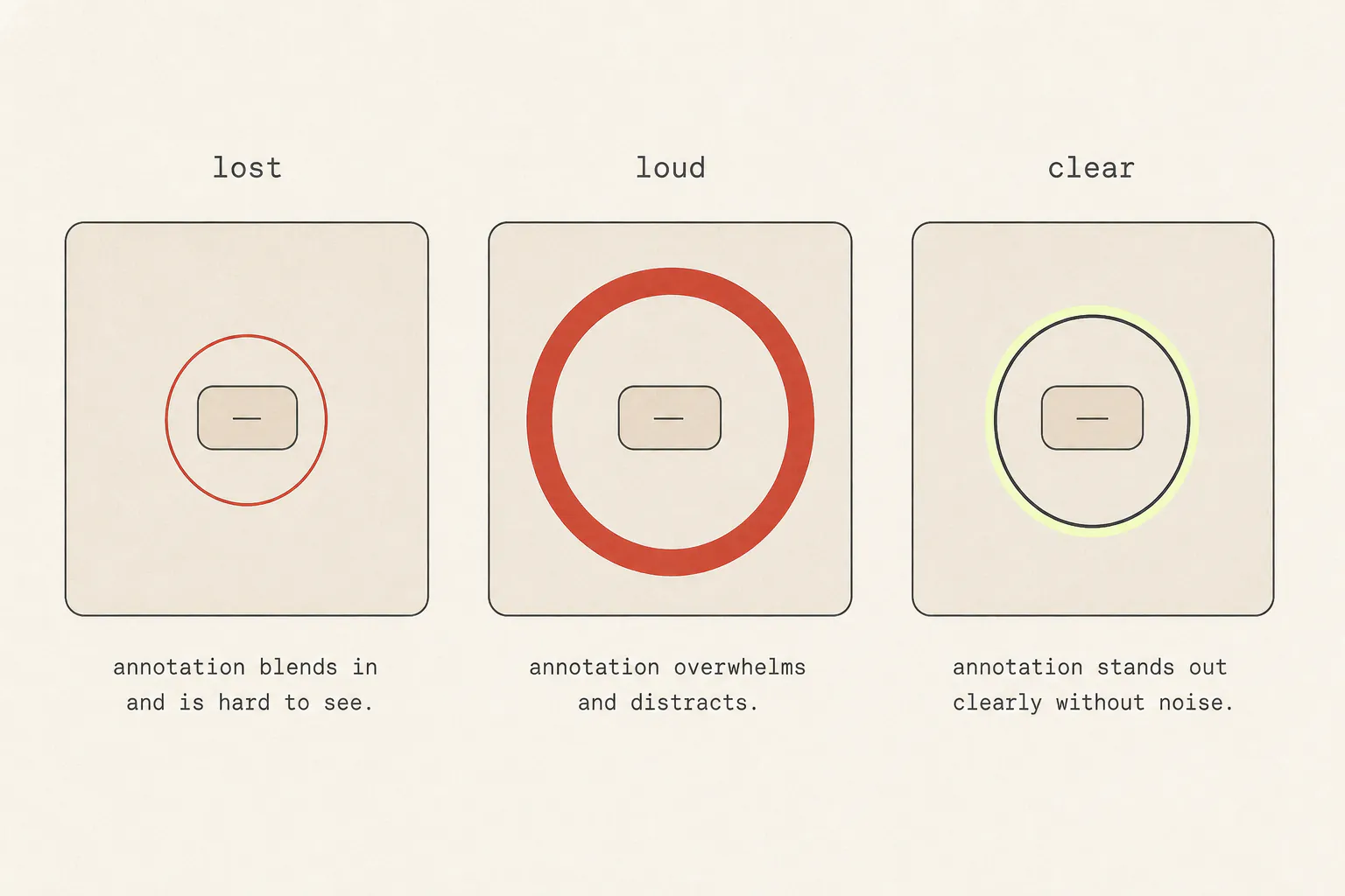
Red is conventional, and on a page with a red brand colour, red error states, or a warm photographic background, it disappears. Scan the crop before you draw and choose something the design is not already using — magenta, bright green and cyan are rarely in a brand palette.
- Weight matters as much as hue. A 2–3px stroke reads on any background. A 10px stroke covers the thing you are pointing at.
- Do not rely on colour alone. Roughly one in twelve men has some degree of red–green colour blindness. A number inside the marker survives that; a red-versus-green distinction does not.
- Leave a gap. A ring drawn a few pixels outside the element keeps its edges visible — which is often the exact detail under discussion.
5. Keep the URL and the viewport width
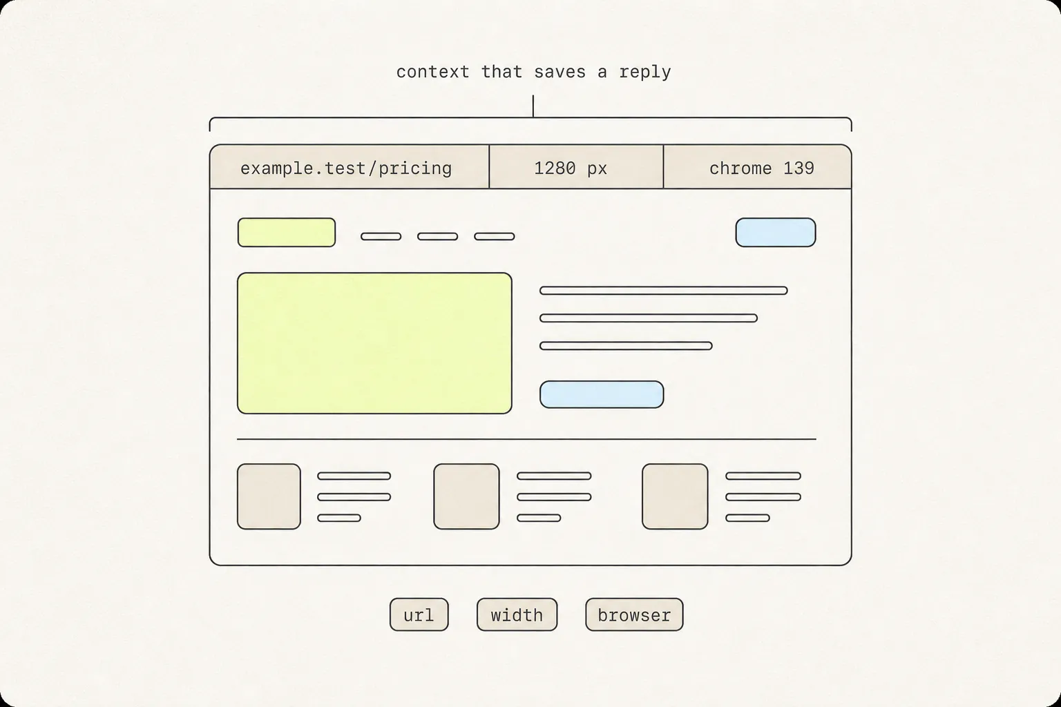
The most expensive missing information in design feedback is the width the screenshot was taken at. A layout bug that appears between 1024px and 1180px is invisible to anyone outside that range, and “it looks fine to me” is where the thread stalls.
Three fields cover almost every case:
- The URL, including any path or query that produced this state. Capture the address bar, or type it in as text.
- The viewport width in CSS pixels. Not your screen resolution — the browser window’s inner width. Type
innerWidthin the console if you need it. - The browser and OS, if there is any chance it is specific to either.
Add anything else that is genuinely required to reproduce: logged in as which kind of user, which account state, which feature flag. If the answer takes more than a line, put it in the message rather than the image.
6. Write the sentence, not the adjective
“Too big”, “weird spacing” and “doesn’t feel right” all describe your reaction rather than the problem. They are honest, and they are unactionable. The fix is a two-part sentence: what you observe, and what you expected.
| Instead of | Write |
|---|---|
| “Spacing is off” | “The gap above the heading is larger than the gap below it — they should match.” |
| “Button looks wrong” | “The button is using the secondary style. On this page it should be primary.” |
| “Text is too small” | “This is 12px. Body text elsewhere on the site is 16px.” |
| “Broken on mobile” | “At 375px the price overlaps the badge. Screenshot attached at that width.” |
You do not need to propose a solution — that is often the designer’s call, not yours. You do need to be specific about the observation, because that is the part only you can see.
The toolkit, and when to reach for what
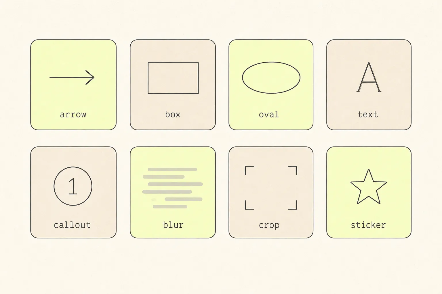
The tool matters far less than the habit, but one thing does make a measurable difference: whether annotating means opening a second application. If capture and markup live in the same place, people annotate. If markup means saving a file, finding it, opening an editor and exporting again, they send the raw screenshot and type “the button at the bottom”.
Grabby’s full-page capture opens straight into an editor with all eight — select, crop, rectangle, oval, line, arrow, text, blur and stickers — with single-key shortcuts (C to crop, A for arrow, T for text, B for blur), undo and redo, and PNG or PDF export at the end. The image stays in that tab; nothing is uploaded. If you are doing this often, Grabby is free on the Chrome Web Store.
A two-minute routine
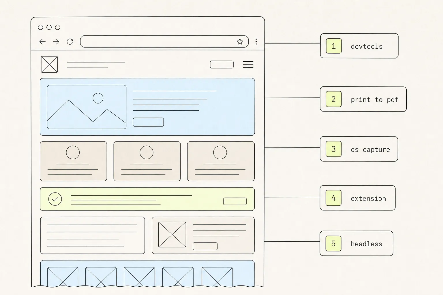
- Set the window to the width the problem occurs at, and capture the full page (here are the five ways to do that in Chrome).
- Crop to the component and one ring of context.
- Cover anything private — real names, emails, account numbers, tokens.
- Place one numbered marker per point, up to about six.
- Add the URL and viewport width as text, or keep the address bar in frame.
- Write the numbered list in the message: observation, then expectation.
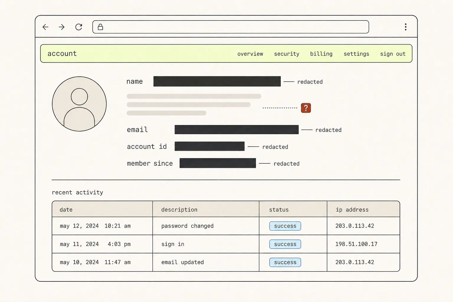
Step three is the one people skip and regret. Blur is not as safe as it looks — redacting a screenshot properly covers what actually destroys the pixels and what merely rearranges them.
One caveat on step one: an annotated image is the right medium for a spacing or colour problem, and the wrong one for “this component behaves oddly when you resize it”. If the feedback is really about behaviour, a different kind of capture will carry it better than any number of arrows.
Frequently asked questions
What is the best tool to annotate a website screenshot?
The one that opens automatically after you capture. The decisive feature is not the brush engine but whether markup requires switching applications — that friction is what turns annotated feedback into an uncropped screenshot and a vague sentence. Any tool with crop, arrow, box, text, blur and an undo stack is sufficient.
Should I annotate on the image or write the feedback in a message?
Both, split by role. Numbers and marks go in the image, because they carry position. Sentences go in the message, because text can be copied, quoted, searched and read by a screen reader. Text typed onto a screenshot can do none of those things.
How many annotations should one screenshot have?
Six at most, and fewer is better. Past that, the reader loses track of which ones have been addressed. Split into one screenshot per section or per page state — a review with five focused images gets more fixed than one image with fifteen marks.
What colour should I use for screenshot annotations?
Whatever the page is not using. Red is the convention and it vanishes on any site with a red brand colour or a warm photographic background. Check the crop first, then pick a hue absent from it, and use a stroke around 2–3px. Never rely on colour alone to distinguish two kinds of mark — put a number or a shape difference in as well.
How do I annotate a screenshot on a phone?
Both major mobile platforms have markup built into the screenshot preview: tap the thumbnail that appears after capturing and you get pen, highlighter, text and shapes. It is enough for one arrow and a crop. For numbered callouts and blur you will want a dedicated app — or capture on the phone and annotate on a desktop, which is easier for anything with more than one point.
Should I annotate a screenshot or record a video?
Annotate for anything static — spacing, colour, copy, alignment. Record for anything that involves a sequence: a flow that breaks on the third step, an animation that stutters, a bug that only appears after an interaction. A video of a static problem wastes the viewer’s time; a screenshot of a sequence loses the thing that mattered.
Keep reading
9 min read
How to Blur Sensitive Information in a Screenshot — Safely
The blur tool feels like deletion. It is closer to rearrangement — the information is still in the file, just harder to read. Here is what to cover, and how to cover it so it stays covered.
8 min read
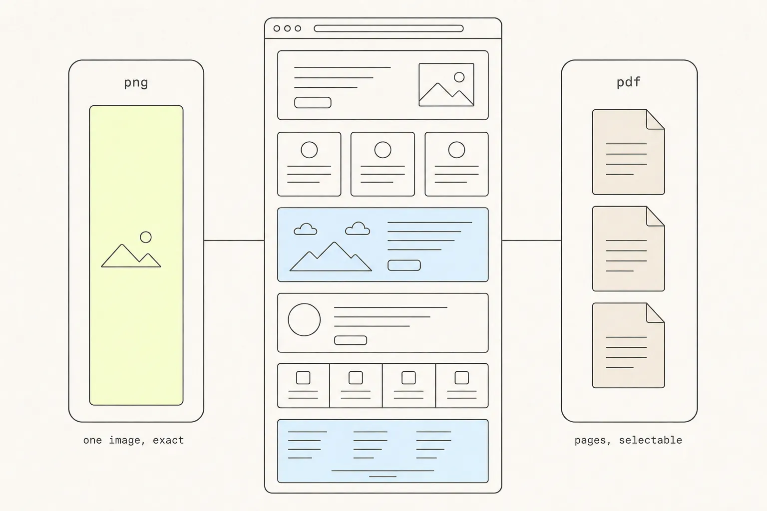
Save a Web Page as PNG or PDF? How to Choose
Both routes end in a file, and one of them is a picture wearing a document’s file extension. Knowing which you have determines whether anyone can search it, sign it, or print it.
9 min read
How to Take a Full-Page Screenshot in Chrome: 5 Methods, Tested
Chrome will capture an entire scrolling page without any extension at all. It just hides the command, and gives up on pages past a certain height. Here are five routes and where each one stops working.